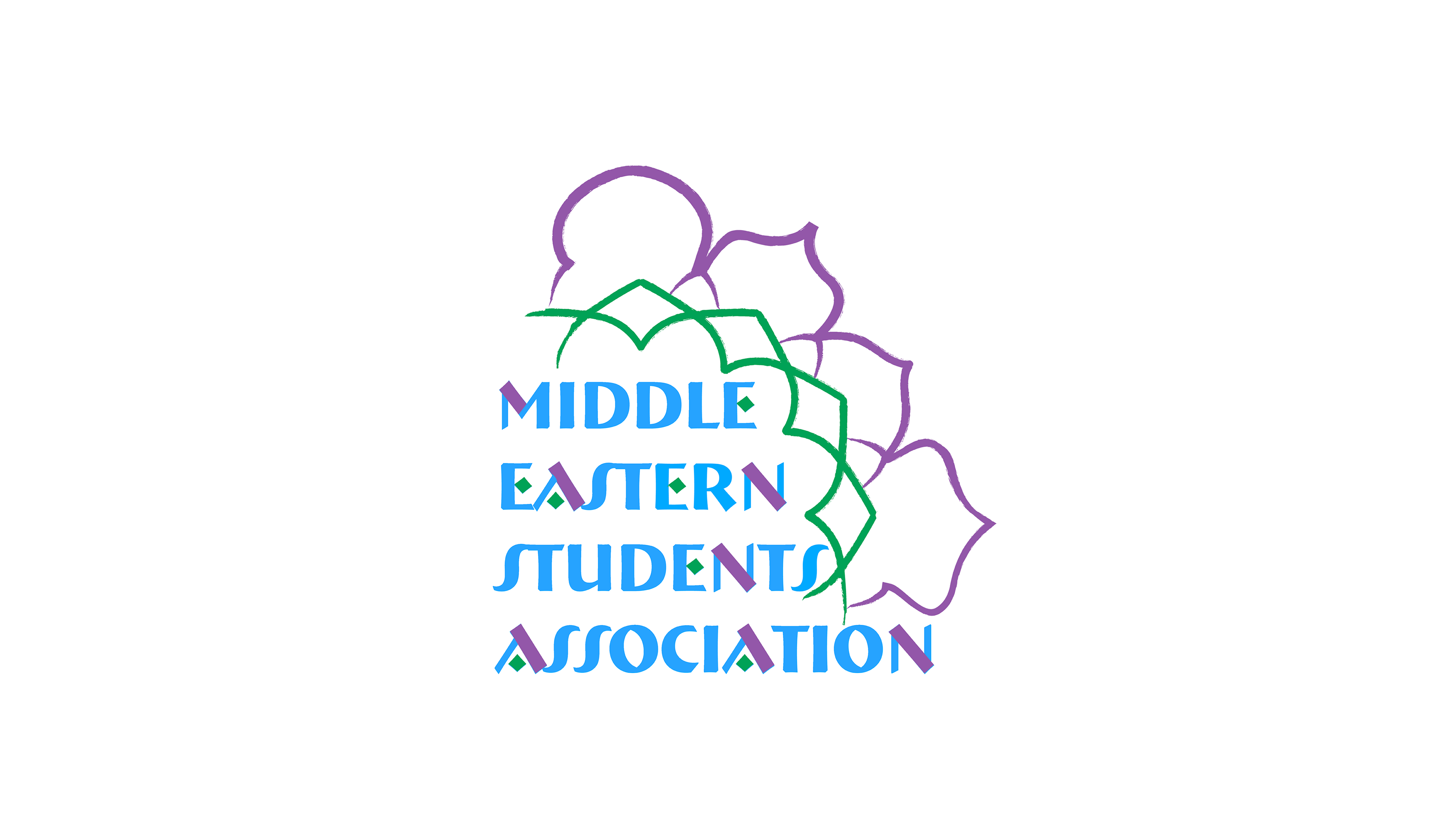
Firstly, I decided to capitalize on the name "MESA". It was short, friendly, and rolled off the tongue much more easily than "Middle Eastern Student Association". I created this lockup for when space is limited, or the logo is to be used in small sizes.
I refined some of the clever ways in which Bremen was altered with blocks of color. Most notably, I removed the diamond from the letter A and replaced it with a normal crossbar. I only wanted the E to have it.
You'll see why.

I created a vertically stacked shorthand logo. It looks great in exaggeratedly large or small sizes.
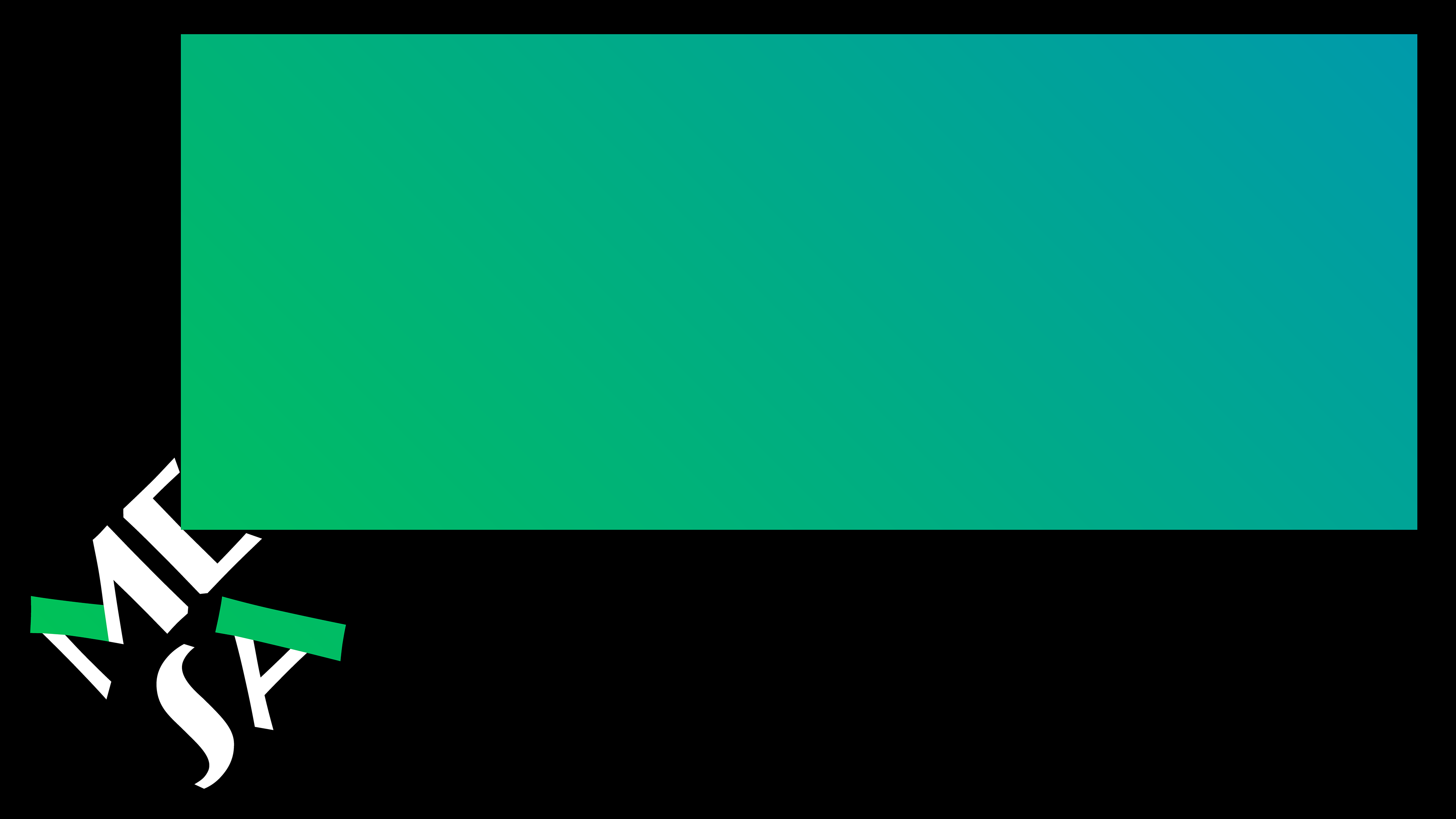
Rotated 45º, the diamond in the E can expand and change sizes and dimensions to create a window for content. The effect is reminiscent of a movie projector.
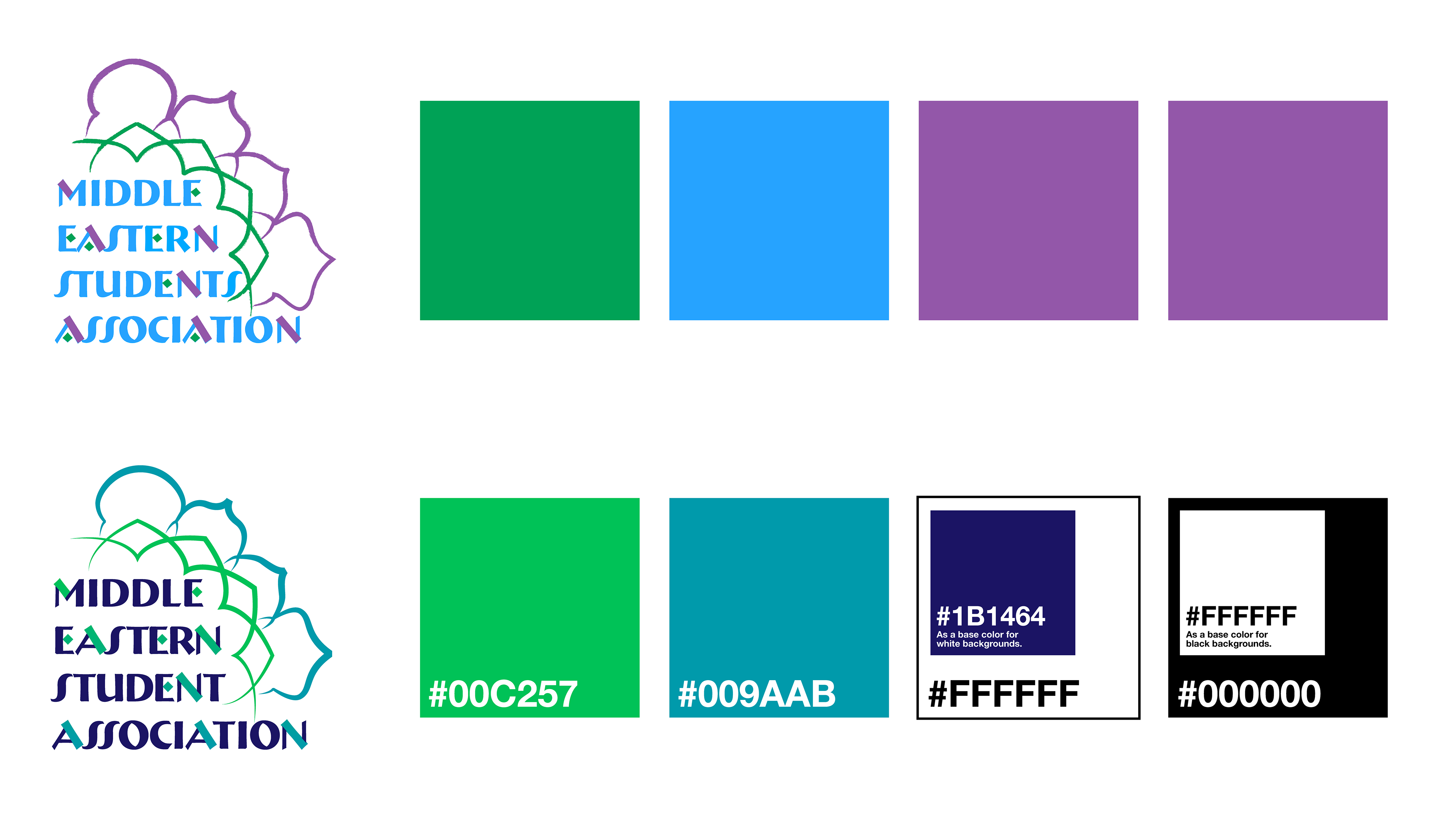
The original MESA colors also had a lot of equity, so I refined those as well. I changed the purple to a darker violet, and changed its use to a base color when the graphic identity had a white background. However, most of the identity uses a black background, where white is the base.
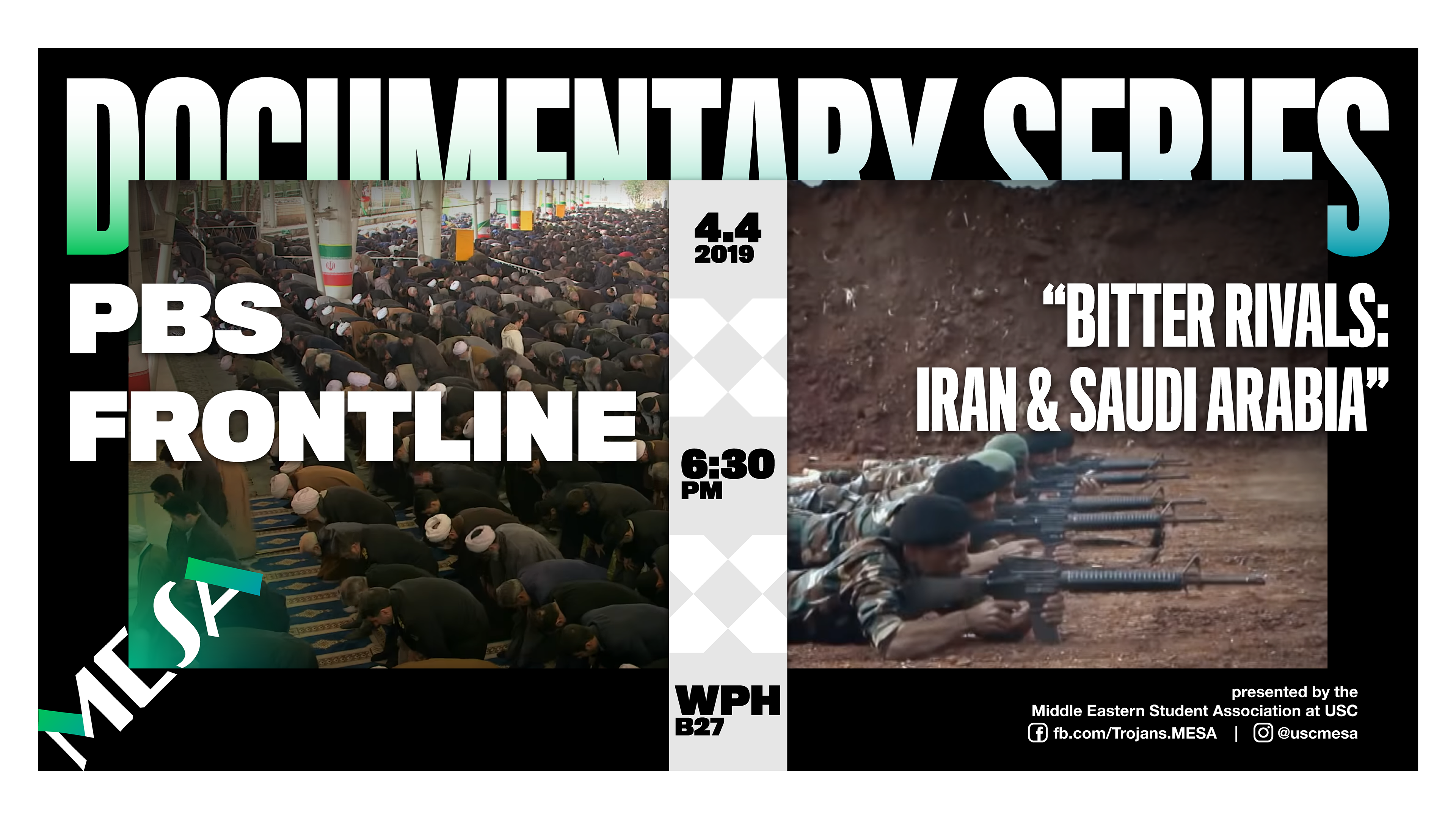
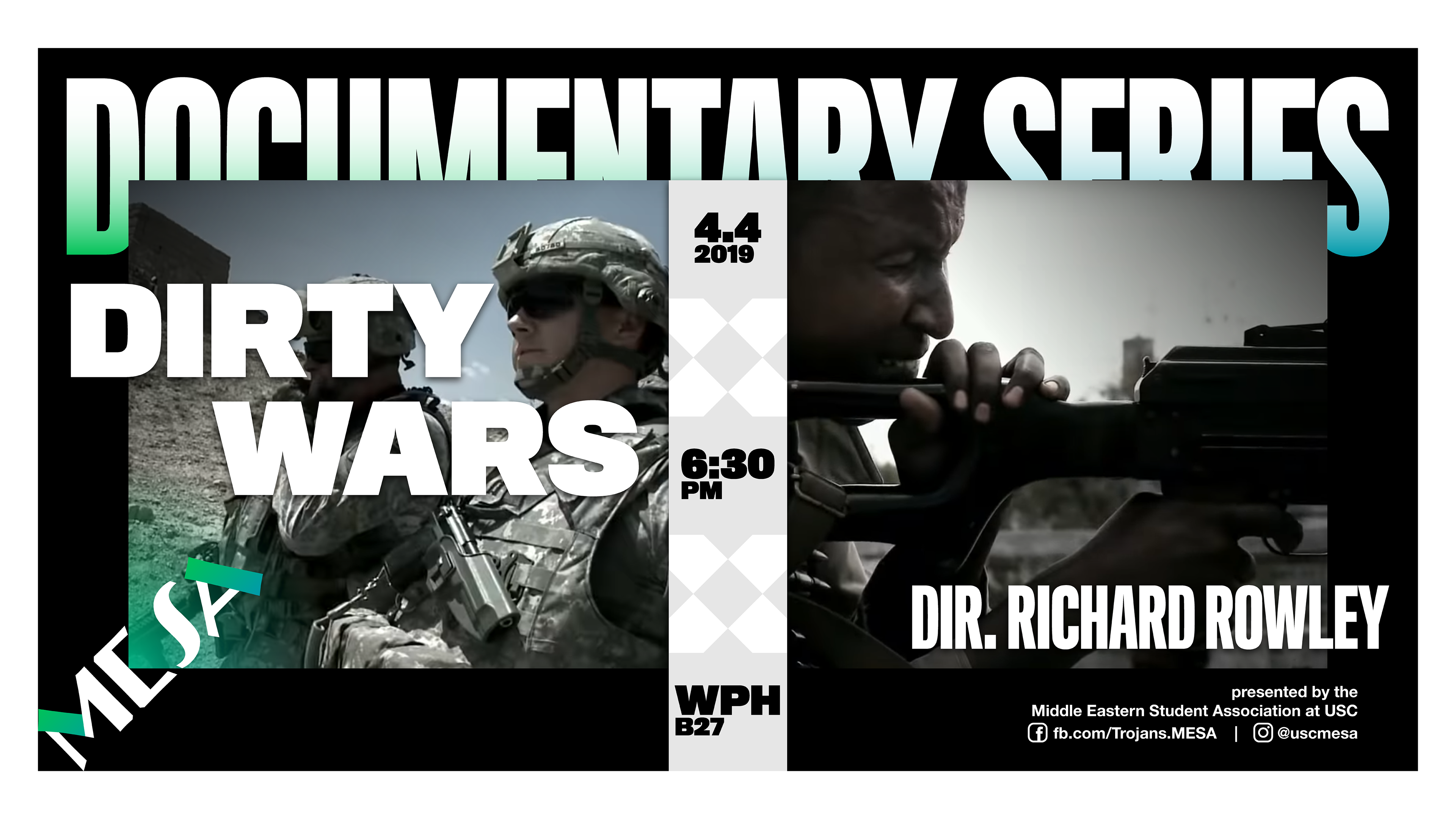
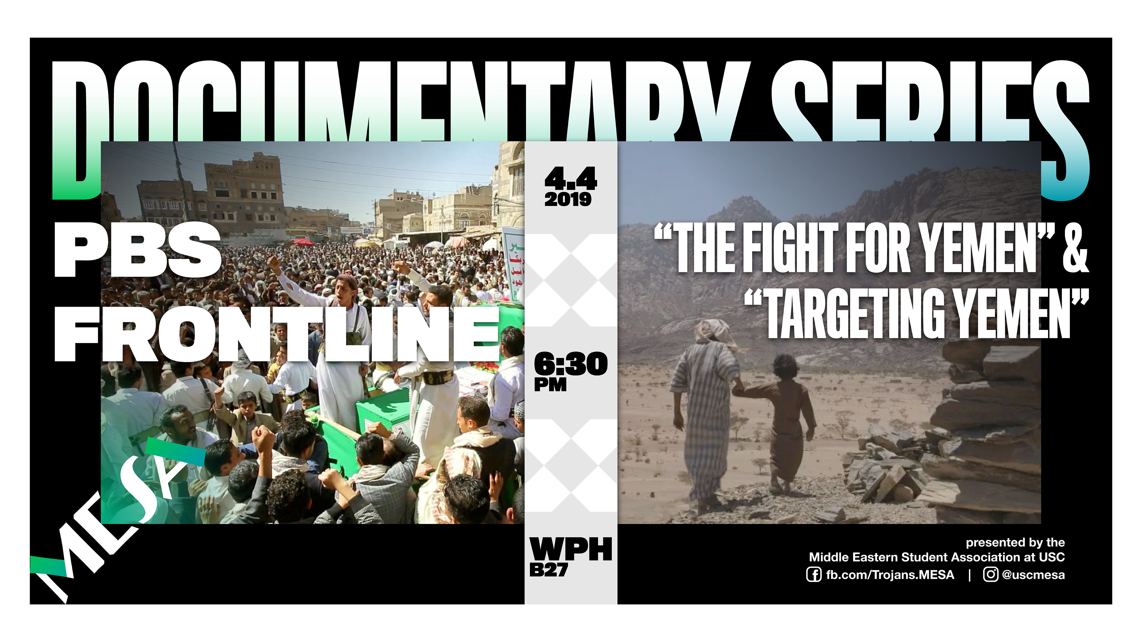
Black was chosen as the main background color to give more importance to the Middle Eastern films and documentaries MESA showcases.
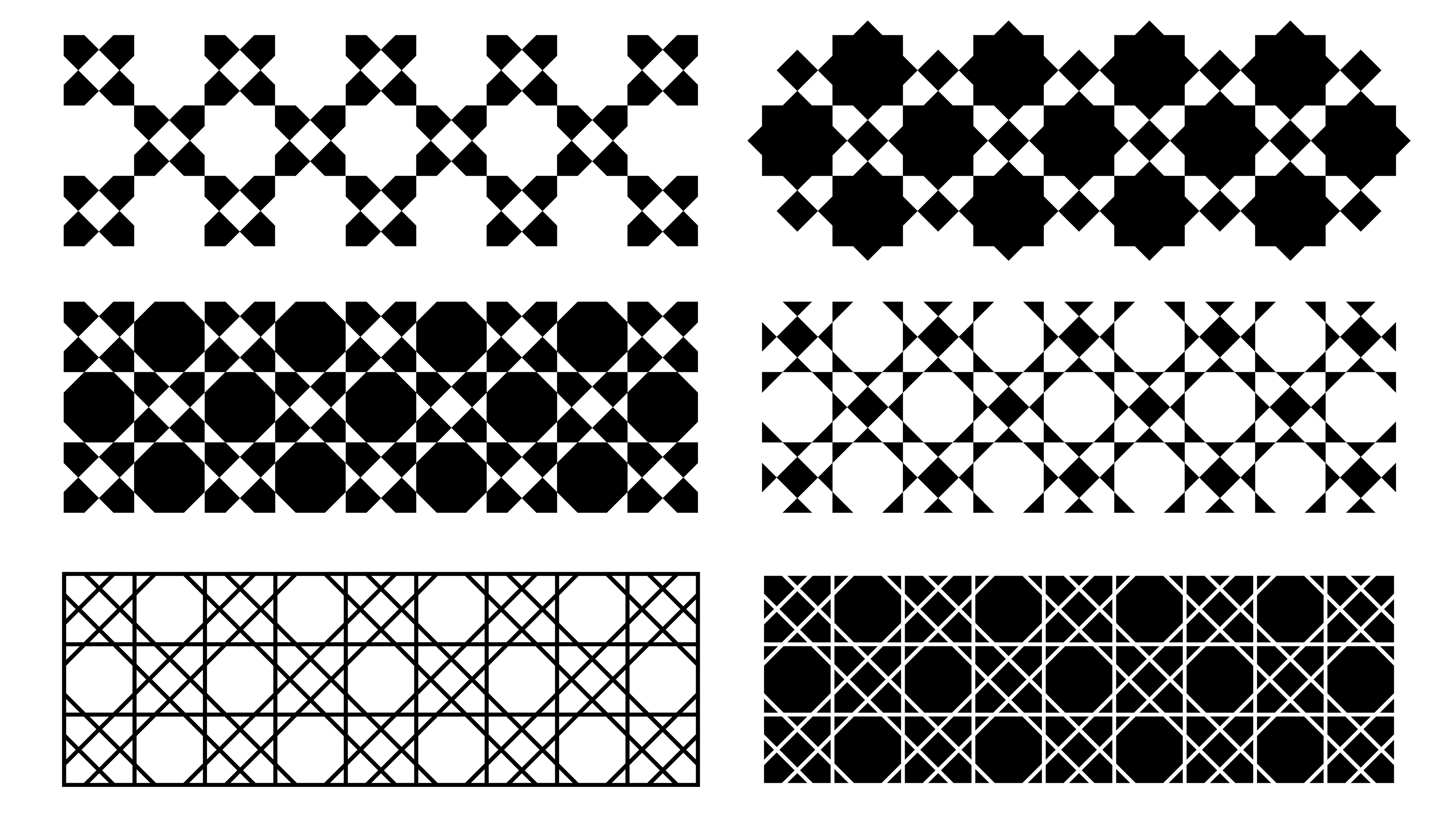
Pattern explorations.
I experimented with many different modernized Arab-inspired patterns for small details in the identity. I decided to employ the top row.
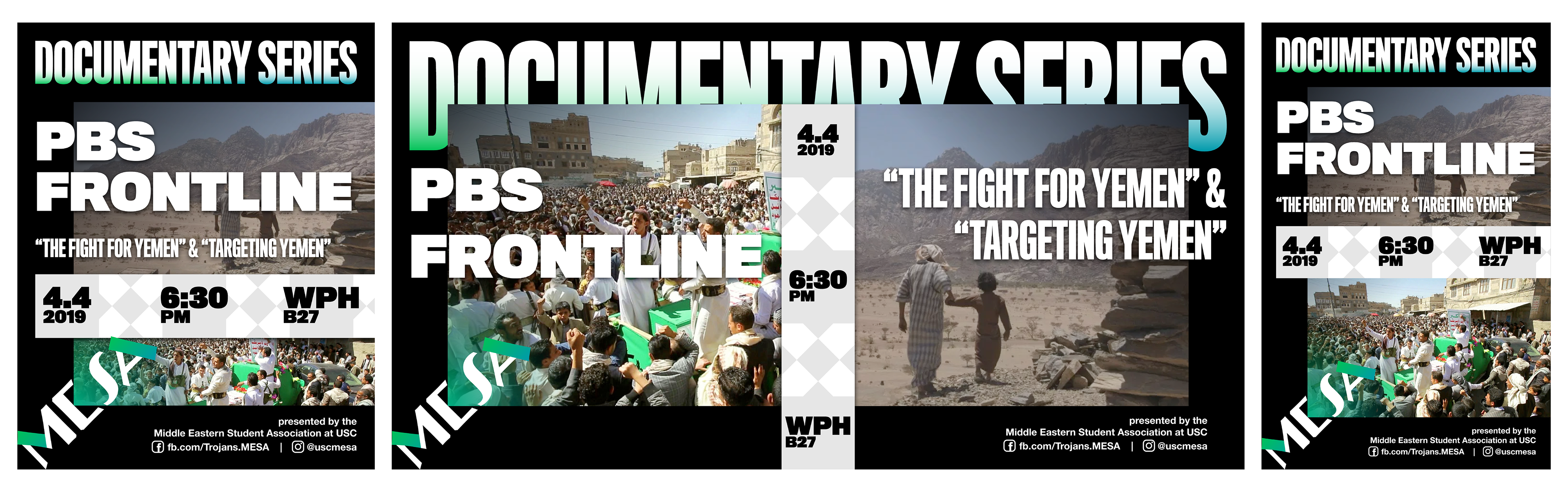
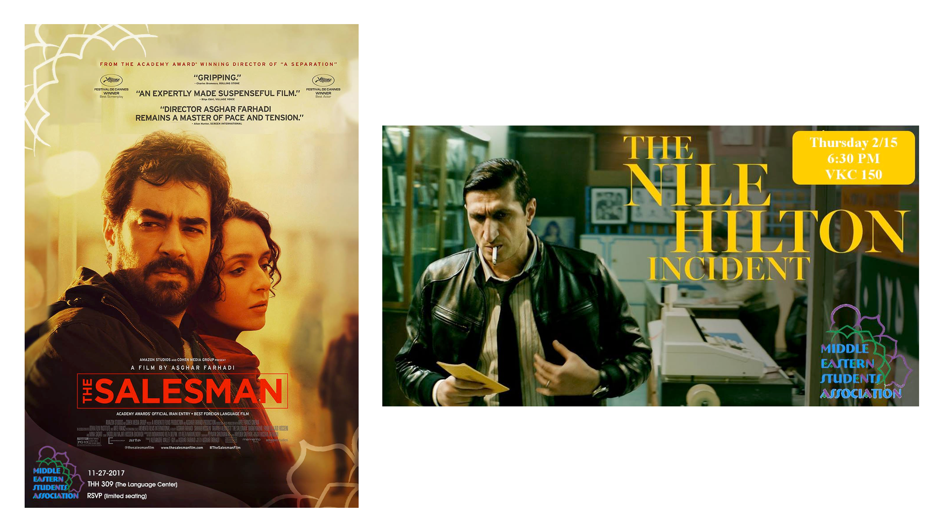
Instagram 4:5 post (Left). Facebook event banner (Middle). Ledger paper print flyer (Right).
A comprehensive template system was created so that screenings could be promoted through different mediums while maintaining a unified identity.
You can see the colors, patterns, and the rotation of the MESA logo to create a window of content.
The graphics would contain two compelling stills from the showcased film, with a green-blue gradient in the corner to tie it to the logo.
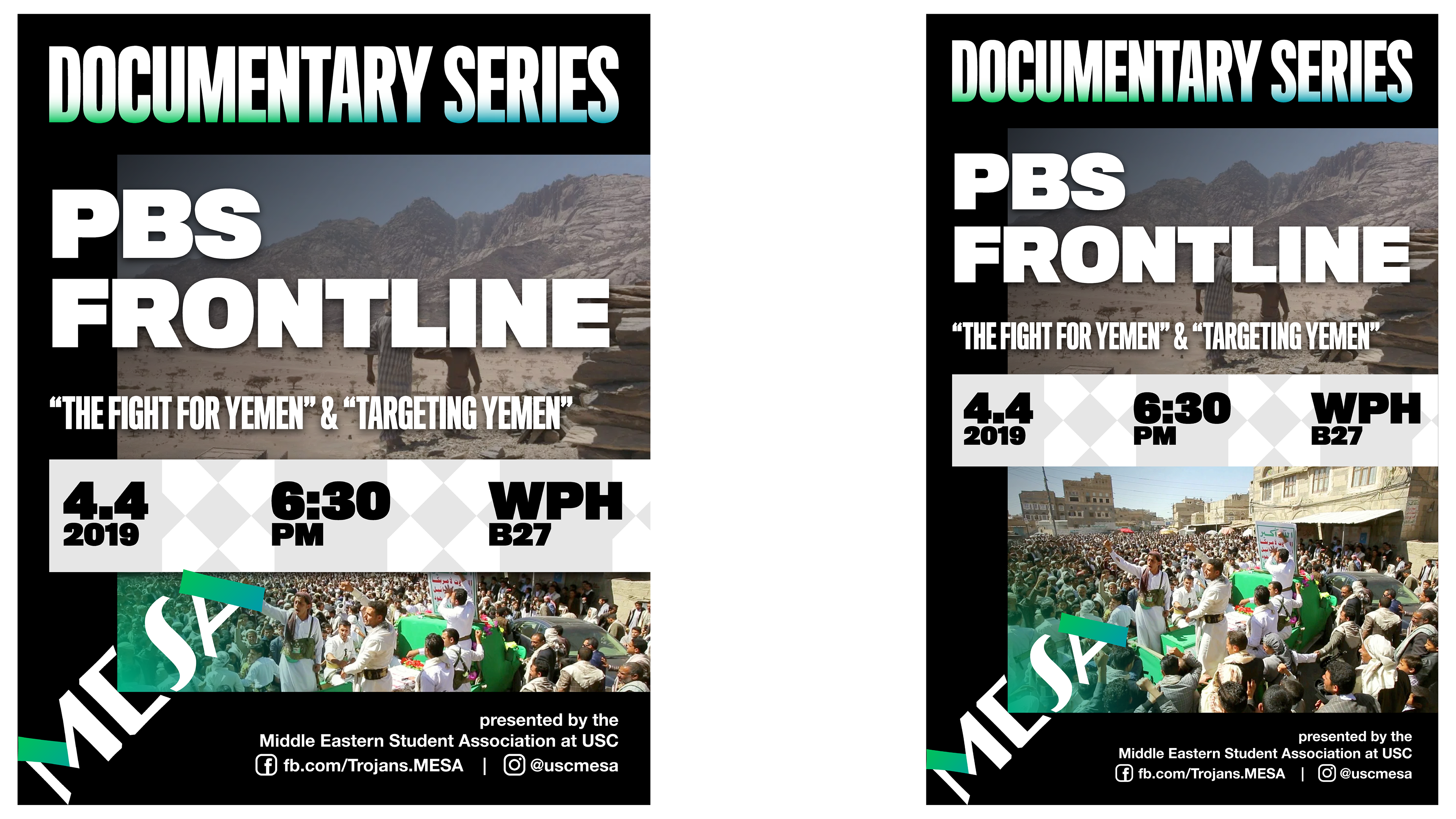
Detail of the Instagram 4:5 post (left), and ledger print flyer (right).