THE PROBLEM
Above is the very first video created for the 2016-2017 school year (my junior year), before I jumped in.
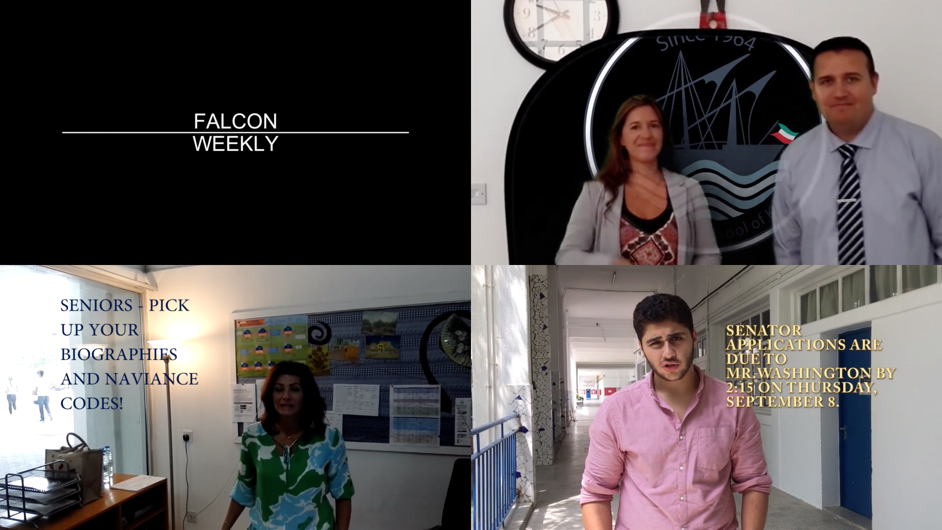
The quality of the videos was lacking, the editing left much to be desired, and the onscreen graphics were inconsistent. The biggest issue, however, was that the videos were BORING. High school students can't be expected to pay attention to a boring Falcon Weekly, so I decided to fix that.
THE SOLUTION

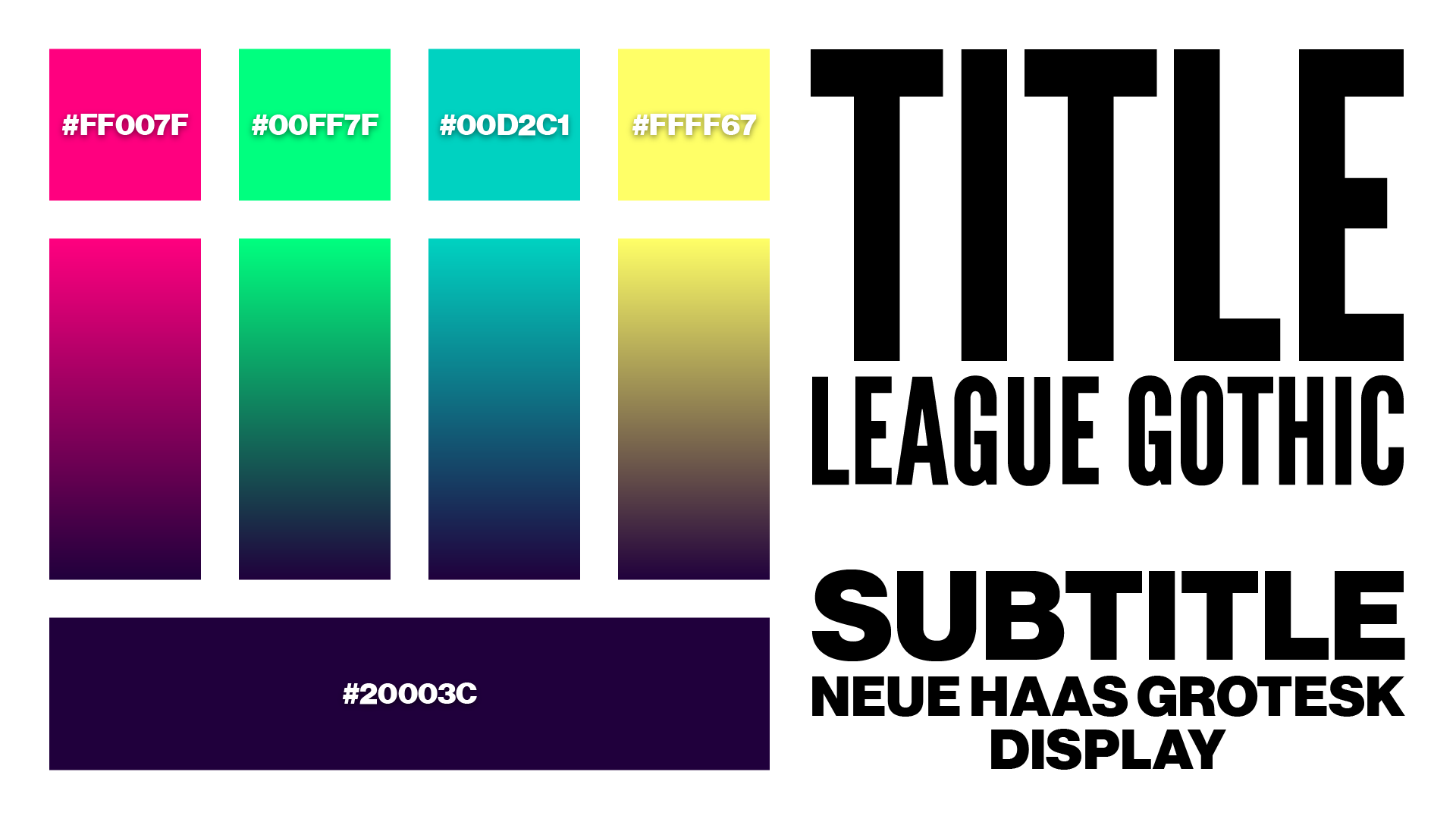
From the get-go, I knew I had to try to make the new videos as eye-catching as I could. I settled on bright, loud colors. Magenta, neon green, turquoise, and yellow would all serve as accent colors, while a dark violet would serve as the base.
Bold display fonts would serve to keep the information as readable as possible. I could afford to use large fonts because, unlike the previous Falcon Weekly, the goal was to keep on-screen information as concise as possible.
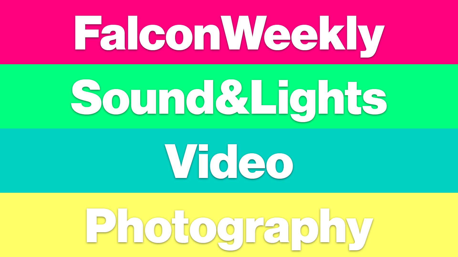
With the revamping of the Falcon Weekly came the founding of Falcon Media. Within Falcon Media there were four branches:
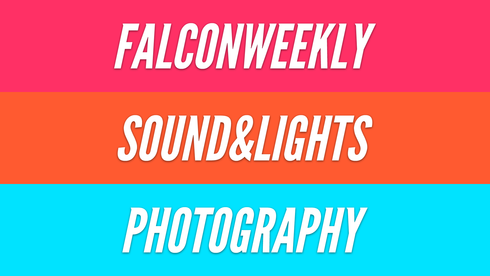
Falcon Weekly—Our weekly video bulletin.
Sound & Lights—Sound and light technicians for school events, and theater and music productions.
Video—Videographers for school events, and content creators for the Falcon Weekly.
Photography—Photographers for school events.

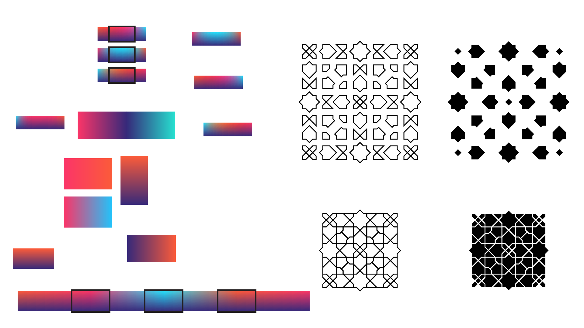
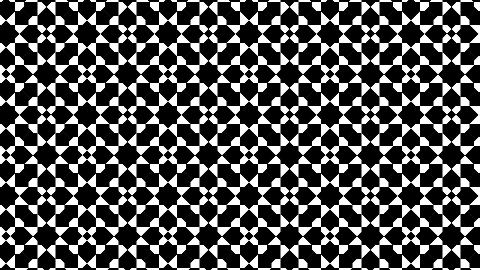
Being in Kuwait, I wanted to put a modern spin on Arabian art, referencing the above shapes throughout the identity.

I created patterns based on these shapes, and the initial units that were repeated are highlighted above.
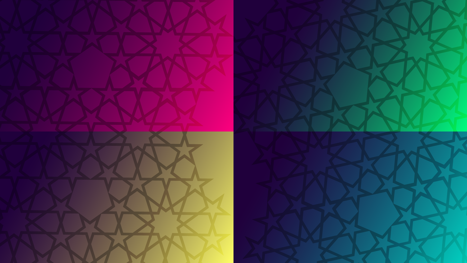

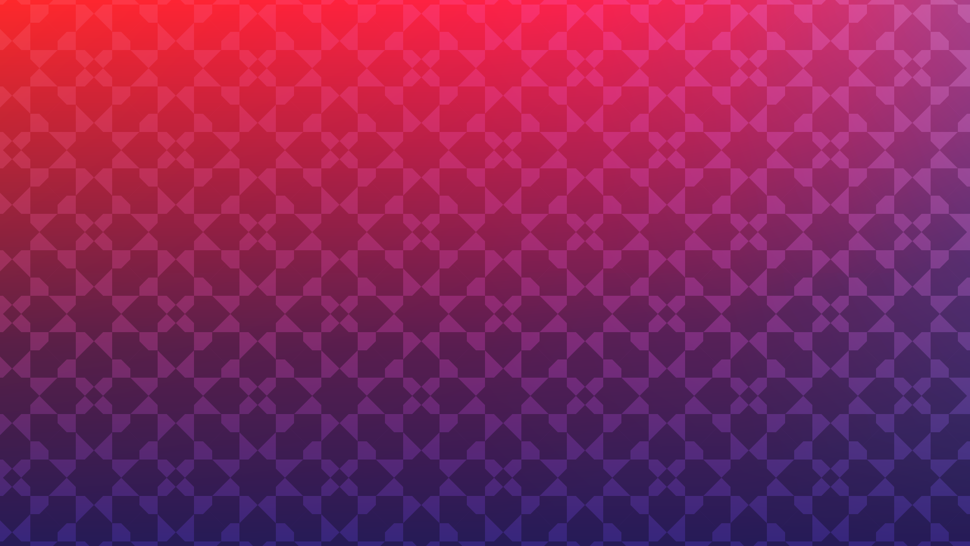
The patterns were overlaid onto the gradients to create the backgrounds for the intertitles.

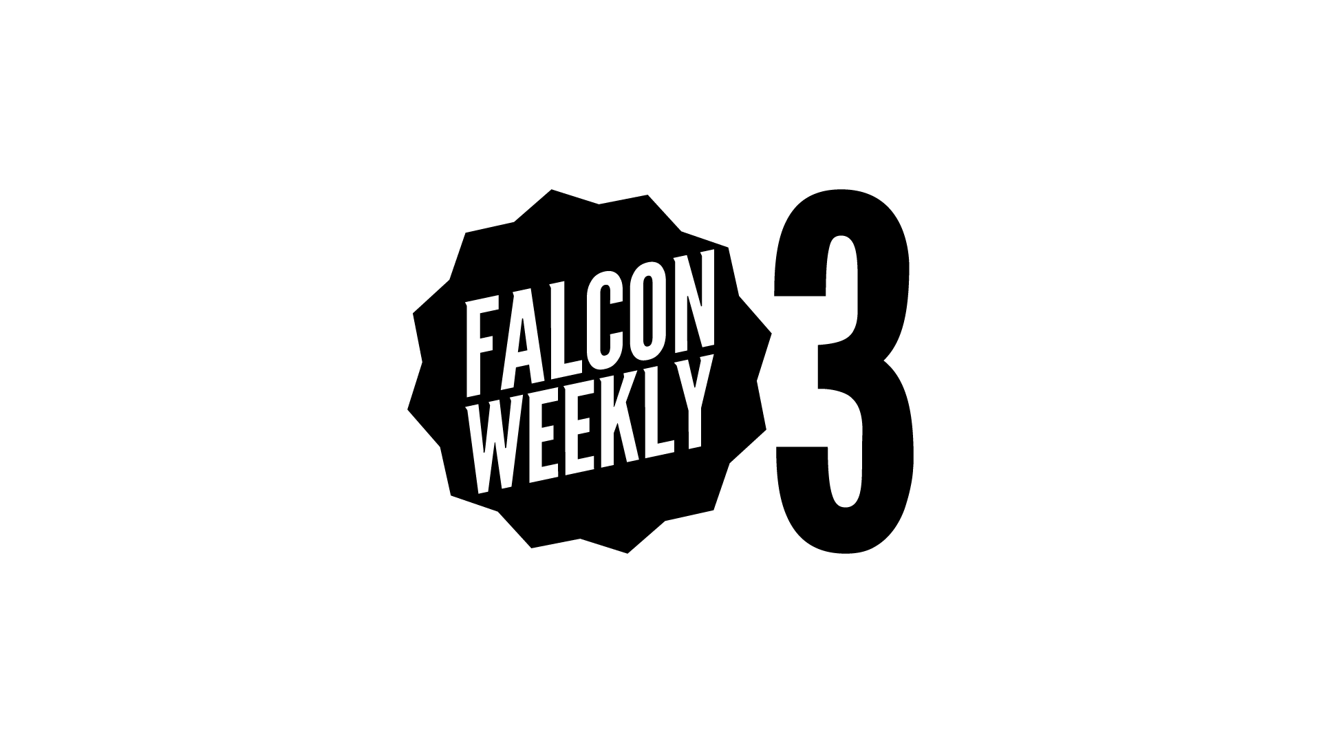
Each video would begin the same. Our school's Dhow, the Falcon Weekly title, the version number (that was just me geeking out), the date, and finally the content.
Some nice animations here and there done in After Effects and Premiere Pro, and bada-bing, bada-boom, the Falcon Weekly was done.
Junior year was hectic, but my buddy Paola and still managed to create content. She handled sound recording and sound editing, while I handled videography and video editing.
THE EVOLUTION
Or so I thought...
During my senior year, Falcon Media expanded. Each division got a team of people, and Paola and I were able to focus more on FM.
I started throwing some stuff together...
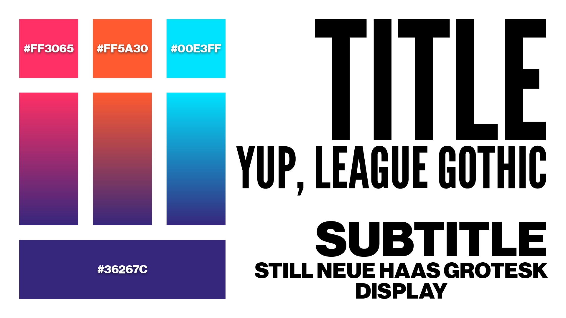
I was (and currently am) still a big fan of League Gothic and Neue Haas Grotesk, so I kept 'em. I decided to tweak the colors so that they worked better with each other.
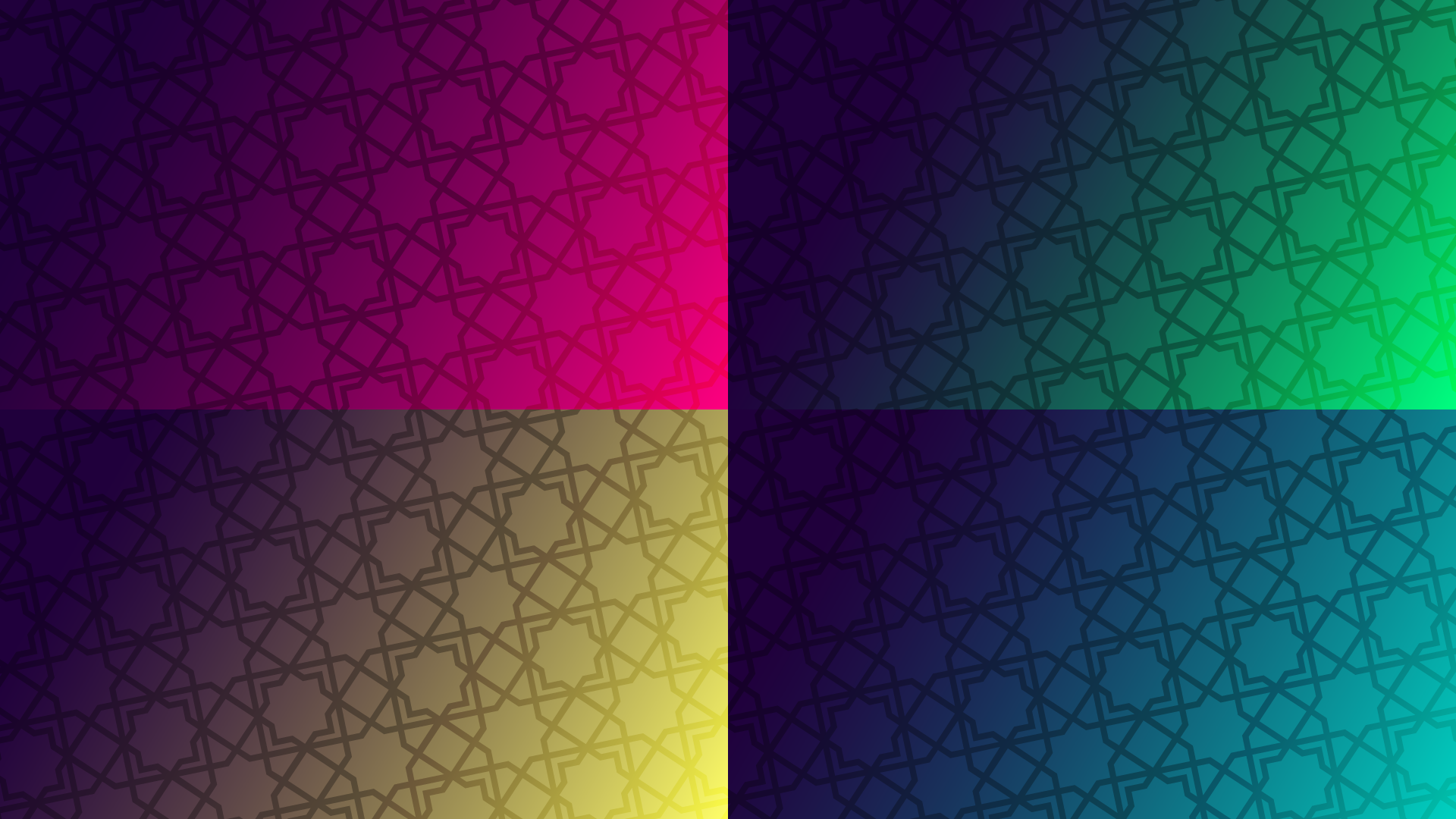
At FM, we realized that we could merge Falcon Weekly with the Video division, reflected in the change from four to three colors.
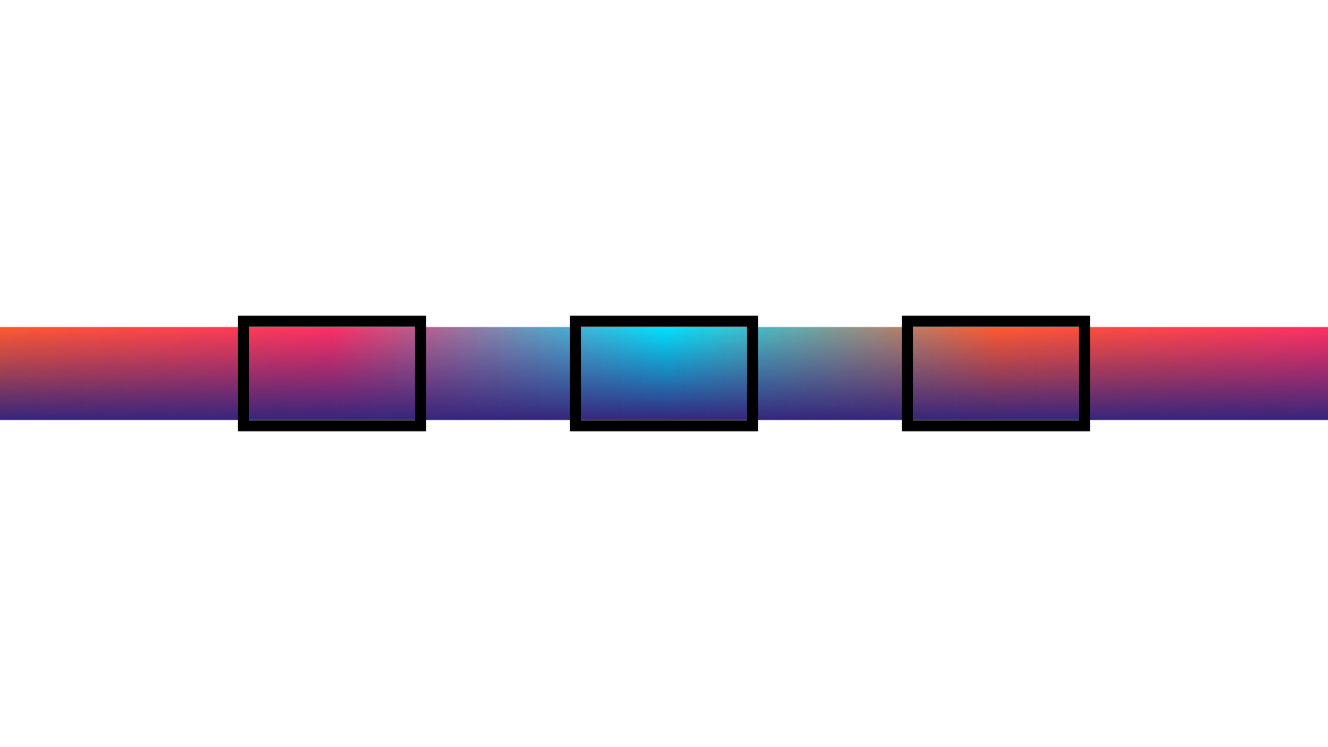
The backgrounds for the intertitles were taken from a larger gradient transitioning between all the colors.
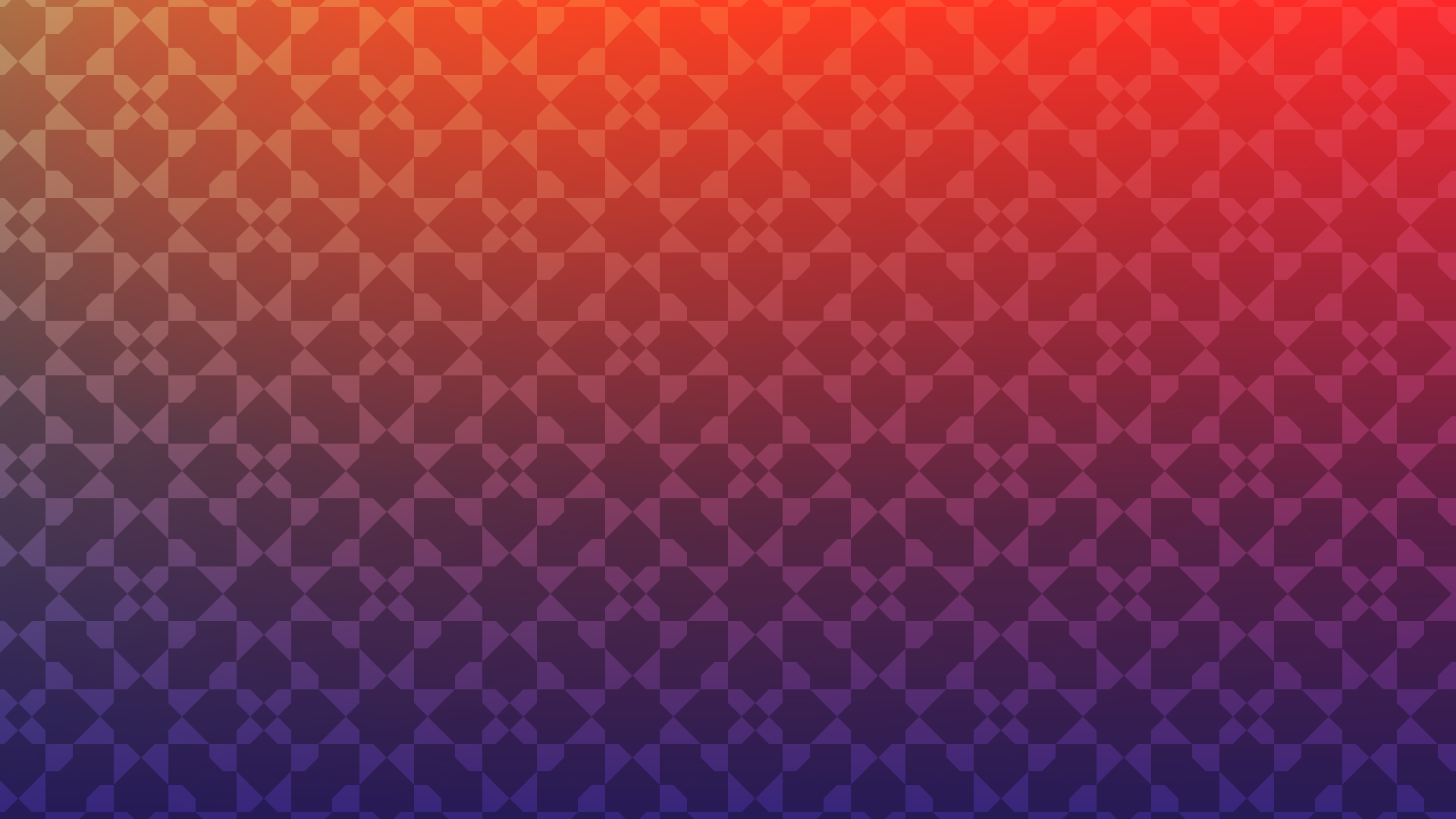
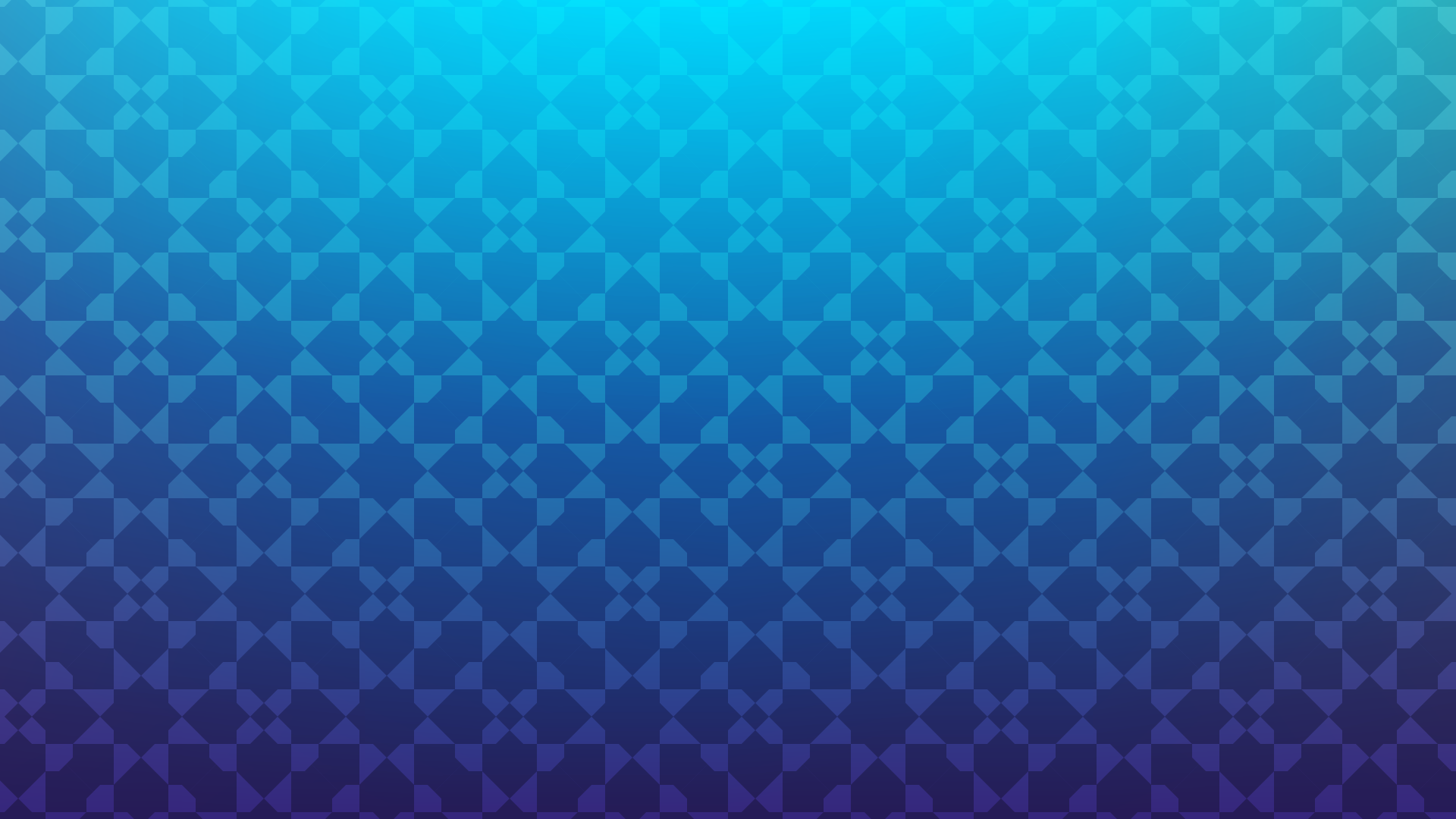
A simpler, more modern pattern was devised, still based on the three primary shapes. Its grid-like structure provided more stability with all the graphics on stage, and it could more smoothly be subdivided and cropped for use in other places.